If you are planning to build a mobile app for your company, it is essential to keep in mind the latest trends for custom solutions. The days of having too many elements in your mobile app have passed. In today’s digital and fast-paced world, user preferences have changed drastically. With limited time in front of them, users are looking for minimalism in UI designs. This will enable them to save valuable time and eliminate the excess (unwanted) elements. The essential elements can then be strategically placed. Minimalism is a simple yet powerful design that can help businesses and brands convey their message effectively to the target audience. Minimalism can be seen everywhere, from the fashion industry to architecture. It has also found its way into the UI/UX design of mobile apps.
What does minimal design in the UI/UX of mobile apps refer to?
- A minimal design means simplicity. It involves having all the basic elements as a part of the mobile app interface to provide a cognitive experience to the users.
- Having a minimalistic design for mobile apps enhances the user experience by a high level of interactivity as it emphasizes more the features and functionalities of the app.
- A minimal design makes it easier for users to understand the workings of the mobile app and eliminates any intricacies.
- It improved the UX immensely by reducing the loading time and making the elements compatible with various screen sizes.
- It offers a perfect combination of user engagement and retention to ensure that users continuously use the mobile app without losing enthusiasm.
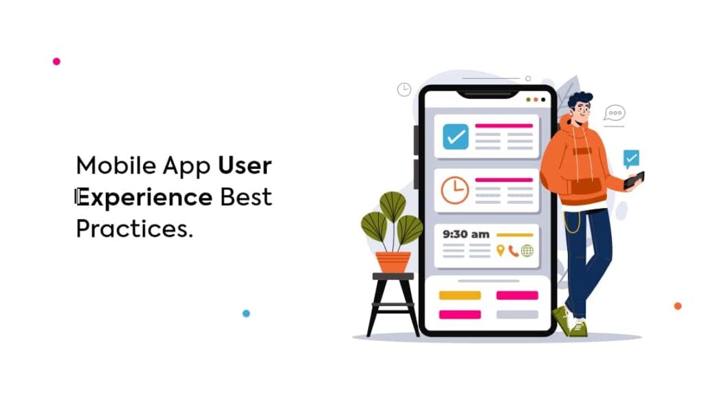
Here are the best practices to enhance the mobile app user experience.
Hassle-free app functionality
- It is important for mobile development companies to focus on perfecting the functionality of the mobile app.
- It is crucial to include only relevant functionalities that will help the users’ complete tasks more easily.
- Including irrelevant functionalities would result in a higher app abandonment rate and slower loading speed.
- Including only mobile-relevant functionalities will encourage more downloads as well.
Personalization
- Be it any industry, personalization is the need of the hour.
- Personalizing the UX by displaying user content wherever applicable in the mobile app is essential.
- The more aligned the mobile app is to the user’s preference, the more likely it is for them to use the app.
- For example, including a welcome message for the user with his/her name displayed on the screen is a great way to personalize the UX.
White space
- In a minimalist design, white space, or negative space, serves as an effective means of highlighting the key elements.
- More the white space surrounding an element, the more it will be highlighted and appear to be important to the user.
- White space plays an indispensable role in creating a hierarchy and contrast for the core elements of the mobile app.
- The white space improves readability and usability. It also helps to divide and structure elements in the mobile app perfectly.
Flat design
- A flat design has fewer elements and curves with no textures or shadows.
- Using a flat design makes it easy and convenient to create images and buttons that appear systematically on different screen sizes and resolutions on different devices.
- Having a flat design instead of a 3D one helps reduce the cognitive load on the users and improves simplicity and readability.
Color scheme
- Using too many colors can put off users from using the mobile app.
- For a minimalist design, app designers and developers can choose a monochromatic color scheme.
- In a monochromatic color choice, a single color is selected and different shades, tints, and tones of a single hue are used.
- By modifying the temperature, saturation, brightness, and contrast, multiple colors and color schemes in a single hue can be generated.
- Designers can also use an analogous color scheme, which is created using three colors that are next to each other.
- An analogous color scheme can be used to create a gradient to prioritize important tasks visually.
Using a single typeface
- The typeface can make or break the success of a mobile application.
- It is essential for mobile app designers to limit the typefaces to one to achieve the best results.
- Using more than one typeface can prove to be disastrous for the mobile app.
Are you planning to develop a mobile application or website redesigning for your business? Get in touch with Nettbyte Technologies today & get a quote for the best user experience for your mobile app.